
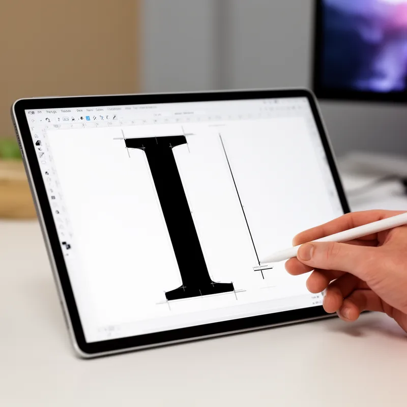
Bodoni font
- noun
- /boʊˈdoʊni fɑnt/
- Specialized
- She recognized the Bodoni font by its sharp serifs and dramatic contrast between thick and thin strokes.
Examples
-
The magazine's headlines were set in Bodoni font to give a classic and elegant appearance.
-
The Bodoni font is often used in fashion magazines.
-
Graphic designers often choose Bodoni font for projects that require a sense of sophistication.
-
I love the elegance of the Bodoni font.
-
Graphic designers often choose Bodoni font for projects that require a sense of sophistication.
-
She recognized the Bodoni font by its sharp serifs and dramatic contrast between thick and thin strokes.
-
The magazine's headlines were set in Bodoni font to give a classic and elegant appearance.
Synonyms
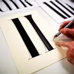
A font with thin serifs and strong vertical strokes
Surface Forms
Morphology
This is a straightforward proper-name + noun composition: 'Bodoni' (the name of a typeface) + 'font' (a type design) yields the meaning 'the font called Bodoni.' The naming pattern 'X font' is compositional and cross-linguistically common, so a B1 learner who knows both constituents can infer the meaning.
Etymology
Bodoni font comes from the Italian printer Giambattista Bodoni, who in the late 1700s designed letters with very thin and very thick lines and small, sharp ends on the characters. Because these clear, high-contrast shapes look clean and elegant, designers use Bodoni font today to give a feeling of 'sophistication'.

