
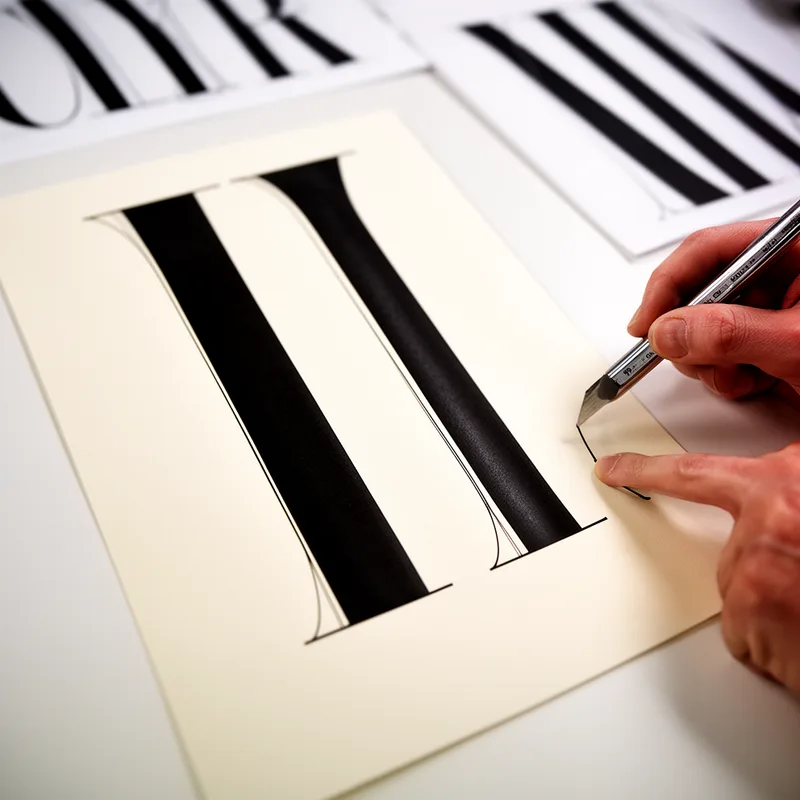
Bodoni
- noun
- /boʊˈdoʊni/
- Specialized
- The designer chose Bodoni for the magazine's title to give it a classic, elegant look.
Examples
-
The striking contrast in Bodoni makes it popular for both headlines and logos.
-
Printed invitations often use Bodoni to add a touch of sophistication.
-
The Bodoni typeface is widely used in fashion magazines.
-
Have you seen the new book designed with Bodoni?
-
The designer chose Bodoni for the magazine's title to give it a classic, elegant look.
-
Printed invitations often use Bodoni to add a touch of sophistication.
-
The striking contrast in Bodoni makes it popular for both headlines and logos.
Synonyms
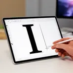
A serif font with strong contrast between very thin and thick strokes and sharp hairline serifs
Compounds
- Specialized
A serif font with strong contrast between very thin and thick strokes and sharp hairline serifs
Surface Forms
Etymology
Bodoni is the name of a font made by the Italian printer and designer Gianbattista Bodoni in the 1700s. Think of it as the designer's 'signature': the style has thin lines and very thick vertical strokes, which is why Bodoni is often used for elegant headlines and invitations.

