
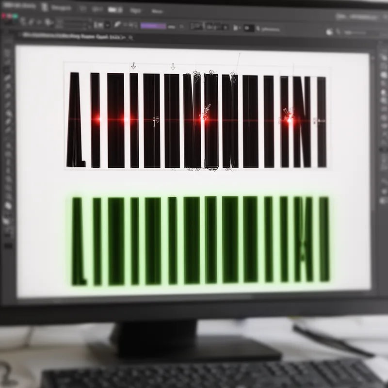
keming
- noun
- /ˈkɛmɪŋ/
- Jargon
- The keming in that poster made the text hard to read.
Examples
-
Excessive keming can ruin the clarity of even the best-designed text.
-
Graphic designers often laugh about accidental keming in amateur posters.
-
The heading on the flyer suffered from keming, making it difficult to read.
-
Look at the keming in this logo design!
-
The article is filled with examples of keming, making some words hard to read.
-
Many typographers cringe at the sight of keming in professional designs.
-
When keming occurs, letters can appear to touch or overlap, confusing the reader.
Antonyms
- Specialized
 1
7.0
1
7.0

The space between letters that designers change to make text easier to read
How Tight
- Jargon

- Specialized
1
7.0
Surface Forms
Etymology
The word keming is a playful change of kerning, the process that controls the 'space between letters'. Designers call bad kerning keming because when 'r' and 'n' sit too close they can look like an 'm', so keming means letter spacing so poor that letters appear joined and hard to read.