
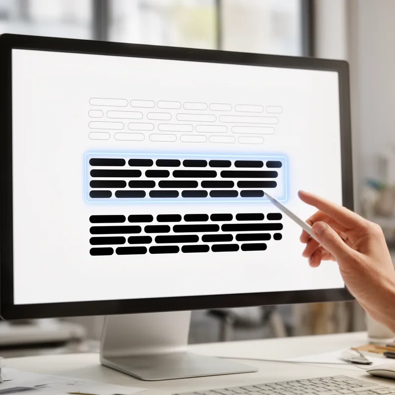
semibold
5.2
Letters that are thicker than regular text but lighter than bold
- adjective
- /ˈsɛmɪˌboʊld/
- Specialized
 :
seminegrita
:
seminegrita
- Source Code Pro's characters look pretty good; the semibold version has the right amount of weight, but in my opinion, the characters are spaced too far apart, and when I choose the semibold variant and then turn on bold, it doesn't get any bolder.
Examples
-
For the report, he selected a semibold typeface to emphasize key points without being too heavy.
-
I prefer using semibold text for headings as it stands out nicely without being overpowering.
-
The designer chose a semibold font to create a balanced look for the website.
Synonyms

midweight
vssemibold
3.9
Of medium weight for clothes or equipment
is used for a typeface weight between regular and bold rather than physical weight
Antonyms



How Bold

Surface Forms
semibold positive
Morphology
Etymology
Semibold combines semi- ('half') and bold, so it literally means 'half bold'. That's why, as an adjective, it describes text that is stronger than regular but not as heavy as full bold.