
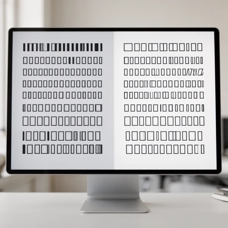
proportional font
- noun
- /prəˈpɔrʧənl fɑnt/
- Specialized
- In proportional fonts, the amount of space used for each letter is proportional to the size of the letter.
Examples
-
Jobs, per Isaacson, speculates that his work on Macintosh proportional fonts led to the proliferation of such fonts across the entire PC world.
Blog text (8) -
Many designers prefer a proportional font for its aesthetic appeal in advertisements and print media.
-
The Mac was not the first screen to have proportional fonts... far from it.
Blog text (8) -
First, it speaks directly to the use of fonts. Do not use a variable-width (proportional) font for program code, as code is not text.
Academic text (2011) -
Well before the arrival of the first Atari, proportional fonts (and WYSIWYG) were a design goal for computer screens and printers.
Blog text (8) -
If Jobs had never lived and Apple had never happened, proportional fonts would still have arrived on screen roughly when they did—many people besides Jobs were working actively on the problem, especially with bit-mapped screens.
Blog text (8) -
Using a proportional font makes the text look cleaner because different letters occupy different amounts of space.
-
A proportional font adjusts the width of each character to create a more balanced look on the page.
Antonyms

- Specialized


 1
4.0
1
4.0
A set of letters where each one has the same width so columns line up
How Monospaced
- Specialized

- Specialized
Surface Forms
Morphology
The noun phrase is compositionally transparent: 'proportional' (having sizes in proportion/relative sizes) plus 'font' (type design) readily yields a font whose characters have differing widths. This adjective+noun combination follows normal English semantics and is cross-linguistically similar, so a B1 learner who knows both words can infer the MWE meaning.
Etymology
Proportional font comes from the simple idea that each letter is given the space it needs: skinny letters like 'i' use little room and wide letters like 'm' use more. That picture of letters in different widths makes text look more natural and easier 'to read', so books and magazines often use proportional fonts.