

monospace


 1
5.8
1
5.8
- noun
- /ˈmɒnəˌspeɪs/
- Specialized
- I think this font has narrowly beaten out Consolas as my favorite monospace font.
Examples
-
An extremely common disqualifying failure of monospace fonts is extravagant waste of space.
Blog text (3) -
Why monospace?
Blog text (3) -
I haven't seen a monospace font I actually wanted to switch to in years!
Blog text (3) -
While it has a fair distance to go to compete with Inconsolata, it's already much better than most monospace fonts that came before.
Blog text (3) -
Monospace is broken then.
Blog text (3) -
Many programmers prefer to use a monospace font for writing code because it aligns everything neatly.
-
The document was formatted in a monospace font, making it easy to read the alignment of text and numbers.
-
Online forums often display code snippets in a monospace font to clearly show formatting.
Synonyms
 1
4.0
1
4.0
A set of letters where each one has the same width so columns line up

A style of text where every letter takes the same amount of space
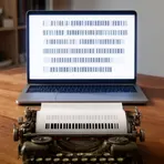
A style where every letter has the same width, like in typewriters

A print style where each letter takes the same space, like an old typewriter
Surface Forms
Morphology
Etymology
Monospace as the name for a font comes from mono- ('one') and space ('area'), because every letter or symbol uses the same 'one space', which helps the text line up in neat columns.