
breakpoint
 3
5.5

- noun
- /ˈbreɪkˌpɔɪnt/
- Specialized
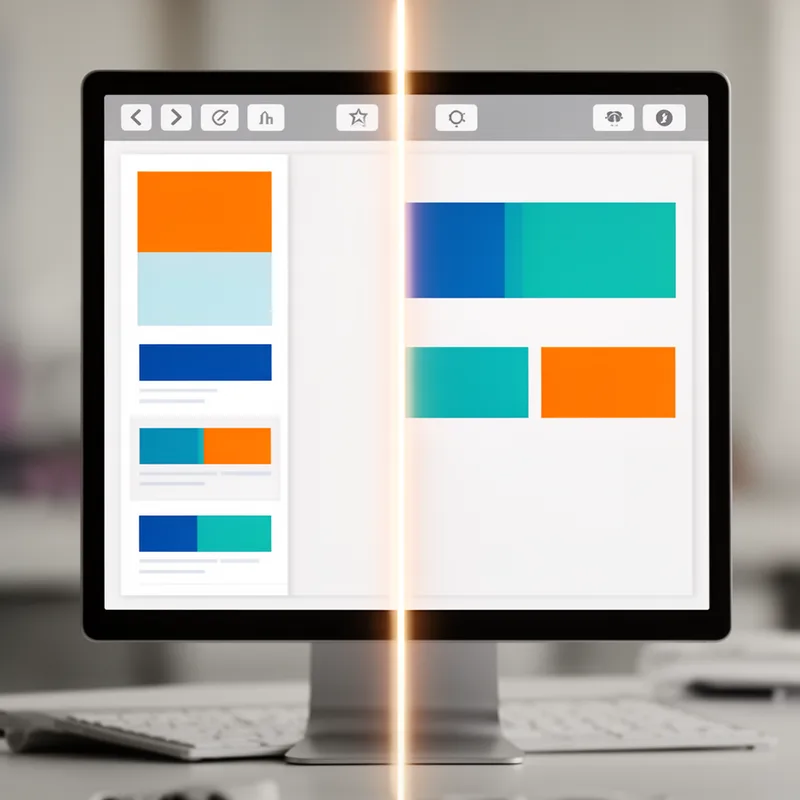
- When designing responsive layouts, understanding where to set the breakpoint can significantly enhance user experience.
Examples
-
I still very much advocate setting breakpoints using media queries within a responsive web design framework.
Blog text (27) -
I cannot go into a design project knowing what my breakpoints will be ahead of time.
Blog text (27) -
Maybe just document in the code what happens to each column size at different breakpoints.
Blog text (24) -
Because the breakpoints should naturally be when the design reaches its limit.
Blog text (27) -
Control which layout a user will see based roughly on their breakpoint, but also have the flexibility of a fluid layout.
Blog text (27) -
I advocate using breakpoints that take their lead from the content (again, content first).
Blog text (27) -
Since the Boston Globe site was released, I've used these breakpoints as a starting base to add to.
Blog text (27) -
Another thought: it's not as if you can't keep using common device sizes as breakpoints.
Blog text (27) -
There's nothing that says our breakpoints, whether in our designs or in our CSS, need to be pixel-based.
Blog text (27) -
In web design, a breakpoint is crucial for adjusting the layout across different screen sizes.
Surface Forms
Morphology
Etymology
Breakpoint joins break 'a change or stop' and point 'a place or moment'. In web design a breakpoint is the screen width where the page 'changes' its look, so the layout can rearrange for different devices.